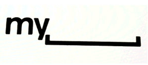
Apparently, MySpace is looking to (forced to by the mass exodus of users) redesign their logo. No longer will it be the three figures to the left of the “myspace.com” text. Oh no… Myspace is actually making the logo more “personable” – you know, all about you! So here’s what they got:

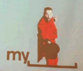
And in that space to the right of the “my” will appear user generated art work when you hover your mouse over it. So when your mouse hovers over it, it will look a little something like this:

So that’s great… really. But my only question is this – who cares?
Who cares about Myspace changing their logo – will anyone even notice?
And I don’t mean to sound so… well… mean about it – but come on, everyone has moved over to Facebook, right? So what’s it matter with Myspace changing their logo?
By the way – I think it’s a terrible idea because, as it is nearly 100% of the time, users hate when companies change their logos – just my 2 cents.
via TechCrunch