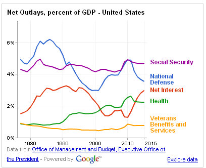
Google’s new public data explorer graphs out the US budget and shows that Social Security is the biggest cost right now to the government. The graph below allows you to see how the budget fluctuates depending on world events.
Last month I wrote about how the engineers at Google are working on a Google Price Index (GPI ) that in essence will allow the United States Gross Domestic Product (and inflation) to be calculated in near real time.
This is nothing short of amazing and quite frankly hurts my head to even think about.
But suffice it to say that Google is really on top of the US Government numbers game. Which is why I found the chart below so interesting as well.
Google has just release the new Public Data Explorer: Visualize the US Budget. Basically, Google is now graphing out the US budget, allowing you to see visually what analysts are always talking about, and what numbers are always listed on the White House website.
You can check out more cool Google graphs here.
But I found the US Government net outlays as a percentage of GDP particularly interesting, and the fact that Social Security is now the biggest outlay as a percentage of GDP.
