Of course, I couldn’t help myself.
After adding the new Facebook Send button to my site, I had to go ahead and play around with the styling a bit more to get both the Facebook Send and the Facebook Like button added to the top of my articles.
Already, the top of my articles are heavy with social sharing buttons. But I figured that if I could actually get both the “Send” button and the “Like” button embedded into the light blue bar I created, it might actually look half way decent.
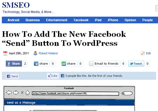
Here’s an image of what I came up with, but you can also just look up above to the top of this and every other article on my site to see it live in action:

As you can see, inside the light blue bar is both the Facebook Send and the Facebook Like button.
For the moment, I don’t think it is too big of a deal having both buttons present on the site.
One consideration is, as always, the more instances of code I have being called per page load, the more of a drag my site experiences and the slower the pages are delivered to end users.
But for now the impact seem nominal, if at all.
What’s the difference between the Facebook Send & Facebook Like button?
You might be wondering, what’s the point in adding both of these buttons to a webpage – don’t they do pretty much the same thing?
And the answer is “no” – they are fundamentally different.
Facebook Send button: this button, when you click it, opens up a Facebook message console that allows you to type in friends and / or group names and send the web page directly to only those individuals.
Facebook Like button: when you click the Facebook Like button, you are in essence giving the web page you are on a thumbs up to all of your friends on Facebook – that’s ALL of your friends, not just a select few.
What do you think?
I’ll let you know after a few weeks how things have been going with having both my Facebook Like and my Facebook Send buttons running simultaneously side by side.
But what do you think about this?
Do you think running both of these buttons to too much, or a good strategy for increasing traffic, exposure, and engagement to your site?