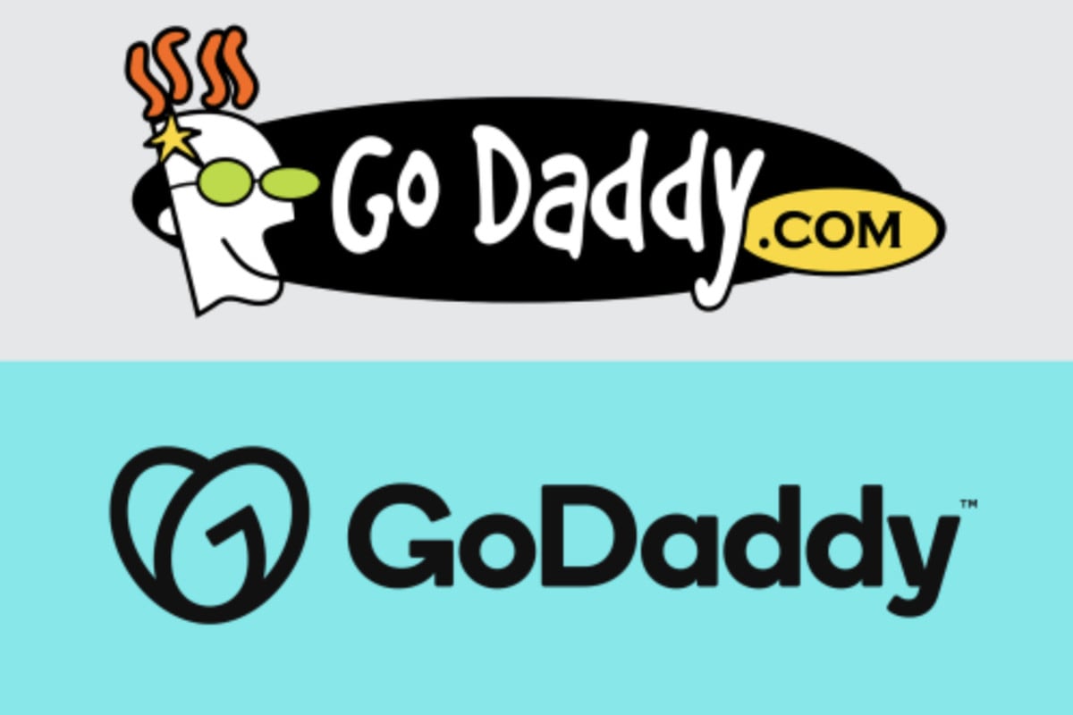
After a very long time, a web service company named GoDaddy changed its logo. Their new logo was reviled not so long ago and it really rattled some cages.
As most of us would expect, GoDaddy continues to deliver a strong message to everyone who is wondering what they are about. Their new logo is definitely a good way to get an insight into their business, work ethics, and much more.
In that light, a generic type of logo that is followed with a heart shape that brings refreshing and new look is actually quite interesting at first glance. When my eye first met the logo, I must say that the ‘’G’’ was being accompanied by the ‘’D’’. But, that’s not the case here, no! The ‘’D’’ I was looking at is actually an ‘’O’’ which then spells the complete picture – ‘’GO’’ and not ‘’GD’’ as I suspected.
Despite the confusion, GoDaddy company said that they specially designed this logo to present a picture and paint a whole new look. That look, of course, being the very collaboration with branding firms Lippincott and Codo. This is all resulting in a powerful entrepreneurial spirit.
Anyway, with that being said, it’s not a secret that GoDaddy wanted to change things up. But, in which direction did they strive this time? Well, one thing is certain – GoDaddy’s logo is now looking like a bleak and generic logo, something like Google or perhaps Pinterest.
But hold on, they didn’t stop there! GoDaddy also changed their homepage in a totally different light. Now, their homepage is appealing more to a bit smaller businesses and entrepreneurs, which actually isn’t that bad at all. Considering the fact that they hold more than 20 percent of the registered domains, it’s safe to say that they brought a bit of fresh air to their customers with this kind of change.
Honestly, GoDaddy really made things change here with the new logo. I mean, they already ditched the word ‘’Daddy’’ from their mascot in 2018 which was a strong sign point towards some really big changes. And, in conclusion, it’s safe to say that GoDaddy is facing and looking towards the future. Their new logo is telling us that they don’t want to be portrayed as a daddy anymore, they are actually turning to a totally new direction.
