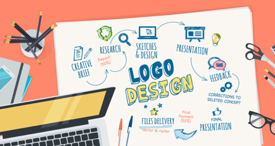
Your company logo is the face of your brand which is why you want it to be as attractive and unique as possible. However, creating an awesome logo isn’t as challenging as it sounds. All you have to do is follow the basic principles of logo design which are:
- Simplicity
Contrary to what people think, the best logos aren’t elaborate or complex- they are simple and minimalistic. Think about the logo of Nike and Apple. How simple are these designs- just a swoosh and a half-eaten apple? Despite their simplicity, they are iconic because they are easily memorable which is also why they are so effective.
- Scalability
When you are designing a logo, then scalability is something that you should always keep in mind. What it means is that your logo should be designed in a way that it can be printed on small objects like a pen or a coffee mug and also large objects like billboards. The good news is that how we design logos has changed a lot today and you can use advanced logo designing tools online to upscale and downscale your logo in real-time.
- Timelessness
If you have never designed a logo before, then it’s natural if you want to draw inspiration from other popular designs. You may also want to study the latest logo design trends to get a few ideas for your own logo. However, it’s important that you don’t get carried away with a graphic design fad that may not last for long. This is because the best logos are timeless and they have the same impact on the target demographic for decades. There are many good examples that support this concept viz. Shell, Nike, Adidas, etc.
- Right Colors
Did you know that you can use color psychology to give your business an edge? When you are designing a logo, you need to keep the colors in mind. For instance, if you want to establish an authoritative and formal brand, then black is a good color to include in your design. In the same way, if you are creating a logo for a females-oriented brand, then you can’t go wrong with purple and pink.
- Right Fonts
Just like different colors cause a different kind of impact for a brand, the fonts you pick also send across different messages. What you need to keep in mind when you select typography is that it should be unique and attractive. However, it should also be in line with your brand’s vision and mission statement. Of course, you can compare some of the most popular fonts on platforms like myfonts.com to make the search easier.
- Memorability
Just like visual image content helps your SEO and traffic growth for your website, a unique logo helps you to improve your market reach and attract target customers easily. This is where the next principle i.e. “memorability” comes in. It means that your logo should be distinct and attractive enough to stand out from other popular logos and be easily remembered by the people who get to see it.
- Originality
There are hundreds of thousands of logos in the world today. However, the best logos are always original. If you aren’t convinced, then you can try to think of a logo that’s similar to Audi’s 4 rings or Coca-Cola’s typography? The answer would be “no” because these logos are 100% original and unlike anything else out there.
- Creativity
A large number of logos for messaging apps and platforms use speech bubbles. Similarly, many logos for restaurants use a chef’s hat, knife and fork, etc. The problem with these design elements is that they are cliched. Good logos avoid using cliched entities and use something that’s completely different. A good example of that is Mastercard that uses two overlapping circles of colors red and yellow. While the design doesn’t really have anything to do with finance which is what the brand is all about, it’s certainly unique and iconic. That’s what that makes logos great.
So, there you have it- the 8 principles of logo design that every designer must follow. Remember, all of these are equally important and must be kept in mind when you work on a logo.
