Earlier today I received the official link via email to go ahead and install the RockMelt web browser as a beta tester. When I first installed and opened the web browser, my immediate impression was that RockMelt looked exactly like Chrome with the exception of sidebars added to RockMelt that brought Facebook alive within the browser. I think the Facebook integration into the sidebars is pretty cool, with the exception of one thing.
The majority of what I do online is blog. And both of my blogs are WordPress blogs.
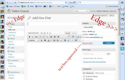
When I have the sidebars open in the RockMelt web browser, the text box of my WordPress blog does not make the adjustment to the change in width. When the RockMelt sidebars open, my WordPress text box should shrink to compensate for the change in width – but it doesn’t.
So if I leave the sidebars in my RockMelt open, then my text box becomes nearly impossible to write in comprehensively.
Here’s a couple of images of what I’m talking about.
My WordPress text box with the RockMelt edges:

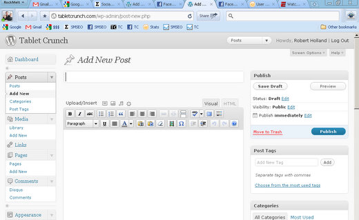
And here’s my WordPress text box without the edges:

You can see in this image, without the edges enabled in RockMelt, my WordPress text box looks fine – like it should.
So there ya’ go – my only, and biggest issue that I have with RockMelt.
And of course, until (or if) this issue is resolved, there really isn’t a reason for me to switch away from Chrome.
Because as I said, RockMelt is pretty much the Chrome browser with the added edges of Facebook integration.