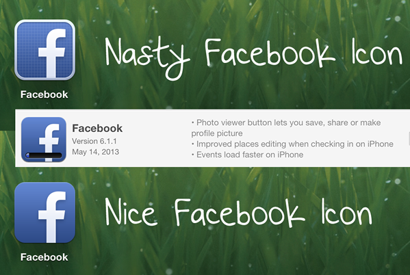
The other day when I updated my iPhone, IOS to the newest version I abruptly looked twice at the icon, for it changed. The new look was horrible. Instead of the clean, blue icon with the subtle gradient and the clean “f” coming from the bottom right corner, I saw a bright blue icon with a very solid, thick border. That wasn’t the shocking part. The icon had a grid like appearance, like a screen. To me this new design was extremely hideous and I couldn’t believe that Facebook released the icon like that. Sure enough, a day or two after they released another update, and along with that update, the icon changed back to a clean, modern looking icon. I was able to catch the old nasty Facebook icon and the new one, so you can see the difference for yourself. I mean, did this icon come out unapproved by someone in charge? Surely Zuckerberg didn’t approve of this, then again, he’s more of a programmer, isn’t he?
![]()
