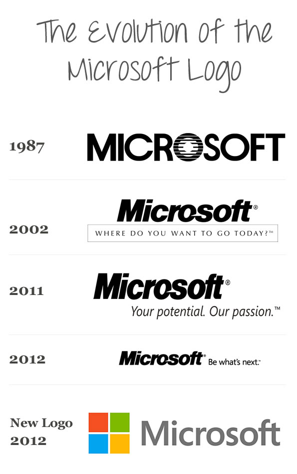
Microsoft unveiled their new logo today. Although I’m not thorougly impressed, I do think it’s an improvement from their past logos. It incorporates simplicity, clean lines, and also keeps the theme of “windows” in their symbol. This new logo was launched before their unveiling of Windows 8, which will be out soon. This logo was considered the first update in 25 years. The logo history wasn’t anything major so they didn’t really consider it substantial enough to call it a new logo. Here is how the Microsoft logo looked throughout the years. (timeline courtesy of Wikepedia)
