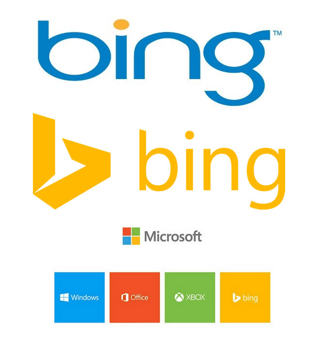
Bing recently redesigned their logo to align it’s branding strategy. I can see why they would do this after looking at the multiple branding colors/logos you can see below the new logo on this page, however I don’t know if I’m a big fan of the “B” icon, it looks a little dated to me, like a lot of Microsoft’s branding does.
“We were heavily influenced by Swiss design with its grid layouts and strong typography, which you’re seeing across the company,” says Scott Erickson, senior director, brand and creative at Microsoft. “This is something I believe in deeply.”

What do you think about this branding move?