Google’s New Look Coming
I actually wrote this article back in February of this year. I noticed a beta version of this new Google look in my browser on February 4th, 2010 and wrote to see if anyone else was seeing what I was seeing.
Anyway, here’s what I wrote back in February about Google’s new look.
I just noticed this… and let me know if I’m either the first one in the world to notice, or if I’ve been blinded by this until now. This is something that I only see while using the Google Chrome browser, and it’s only when I’m not logged into my Google account. So do me a favor, open your Google Chrome browser (click here if you don’t have Chrome), then go to Google.com (without being logged into Google). And tell if you don’t see this:
Screen shots below:
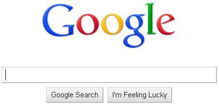
First, the home page and logo itself

There is no trademark symbol in the upper right hand corner (TM). This is clearly present on all other browsers. And to me, it’s also present when I’m logged into my Google account even on Chrome.
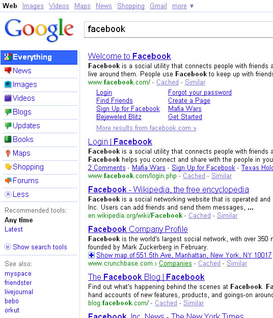
Next, the search options and and suggestions:

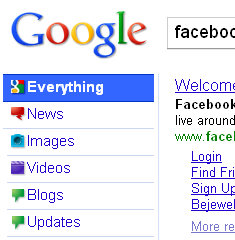
Notice on how the search options (News, Blogs, Videos, etc…) are options that are along the left hand side, and the text and logos for each option is even different. It’s look more “Yahoo’ish” than the standard Google search options I remember.
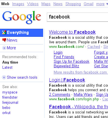
here’s what is looks like without clicking the drop down menu:

Finally, the number of search results:

When the search results pull up, the number of results is in a log smaller text, non bold, and sort of tucked away on the right of the search bar. Obviously showing how these numbers are not really relevant except to a few SEO types (like me…).
These numbers are typically in bold, and placed along the right hand side of the screen above the search results.
So is this a new look for Google?
Is this something I’ve overlooked until now, or are we seeing a new look being tested by Google in the Chrome browser?